Welcome to the Redistricting Visualization Project! This project started one night from a very simple question: what would it look like if you could map a state's congressional districts, past and present, and then watch how they had changed over time? To answer this question, I built the Visualizer tool, which allows you to scroll through a state's changing congressional districts while also providing additional information about the state's population, which party was in control of the state, and why the districts were drawn that way.
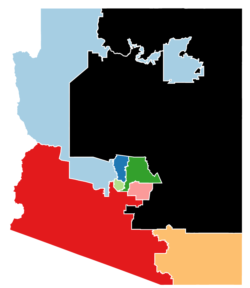
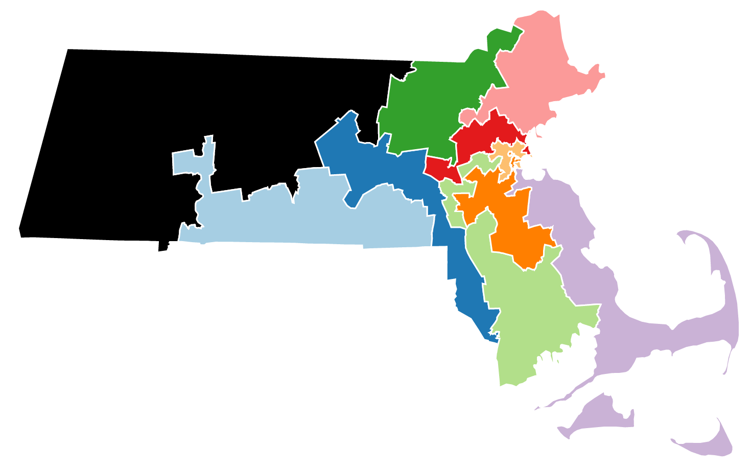
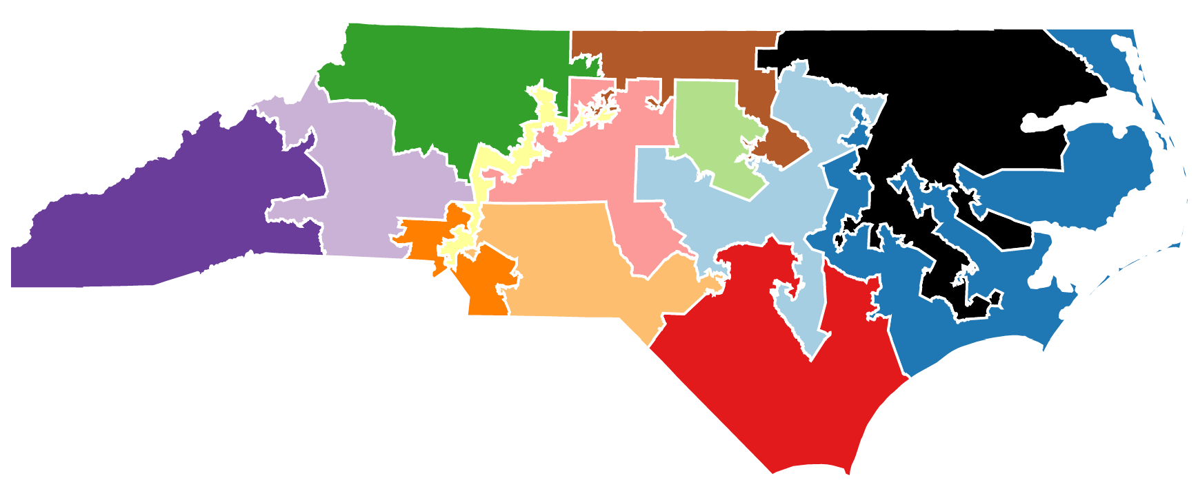
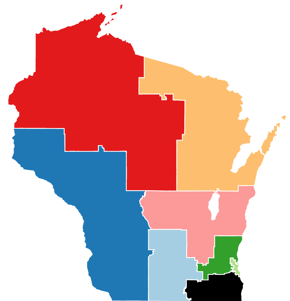
To get started, choose one of the states below. Is there any difference you can notice in the maps before and after the Civil War? What about the 1960s? Or the 1990s? Can you identify gerrymandered districts?
If you'd like to explore the history of congressional districting in more depth, I have written several articles that address a different aspect of redistricting and gerrymandering in the United States. "Overview of Redistricting" provides perhaps a surface-level explanation about the general process of redistricting in the United States, and how it can get bungled up by gerrymandering. "The History of Judicial Redistricting" examines how the court system became involved in redistricting, and the impact that involvement has had on American democracy. "The Gaps in the Efficiency Gap" will explore the potential shortcomings in the new metric before the Supreme Court to "measure" partisan gerrymandering. "How to Fix Gerrymandering" will offer a potential solution to the ills of illegal and distasteful redistricting. As I continue developing this Project, I will continue to publish new articles.
Lastly, if you are curious about the methodology or the sources for the Project, or interested in further reading on the topic, please visit the About page on the top bar. You can also find my contact information, if you have thoughts, suggestions, or want to chat. Cheers!